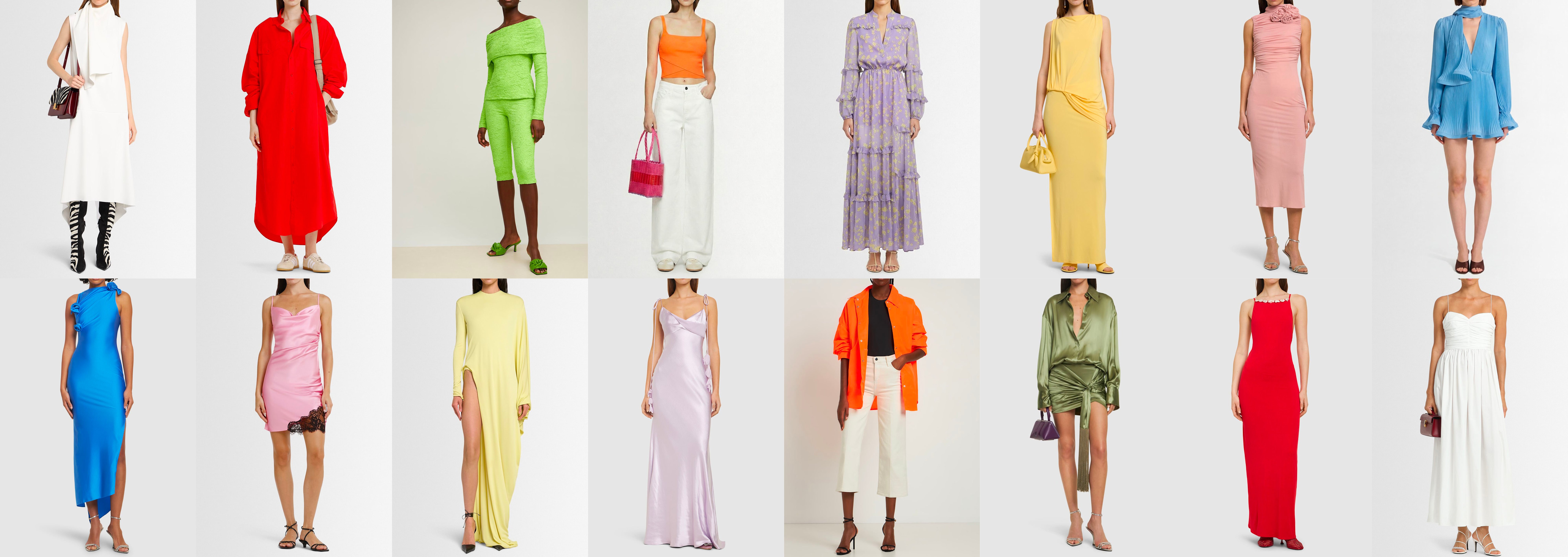
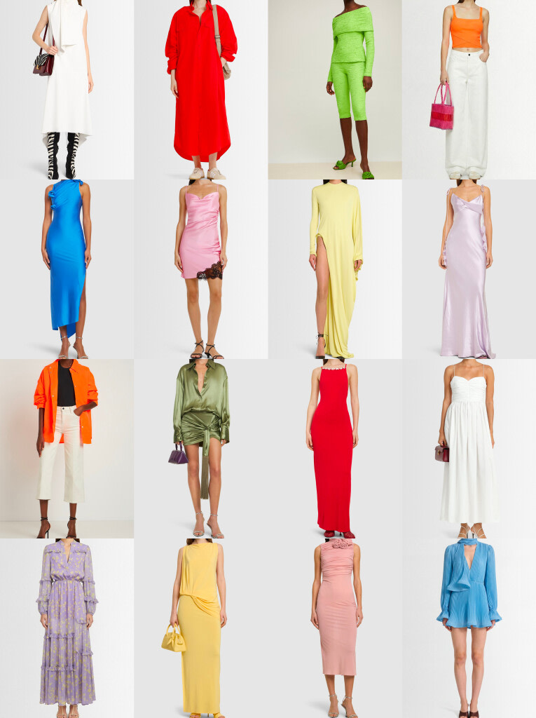
The fashion colors of spring summer 2026 tell the story of a bold, intense season; one that refuses to go unnoticed. After years of quiet luxury and safe neutrals (beige, camel, pearl grey), the runways are sending a clear message: color is back as a personal statement, a form of self-expression that takes up space without apology.
In this guide, you’ll find the complete color palette for the season, including the official Pantone colors for SS26, the standout shades from the biggest luxury fashion houses, color pairing advice for every skin tone, and practical outfit ideas for every occasion, from the office to a night out.
Index
Cloud Dancer: Pantone's Color of the Year 2026 Lava Red: the Statement Color of This Season Tangerine Orange: the Mediterranean Energy of the Season Vivid Green and Olive Green: Two Sides of Spring Summer Navy Blue: the Noble Neutral of Spring Summer 2026 Blush Pink and Dusty Rose: a More Grown-Up Kind of Pretty Smoky Lilac and Deep Violet: the Color Connecting the Fashion Weeks Mustard Yellow and Vitamin Yellow: the Season's Bright Charge Men's Fashion Colors for Spring Summer 2026 FAQ: Spring Summer 2026 Fashion ColorsCloud Dancer: Pantone’s Color of the Year 2026


For the first time in twenty-six years, the Pantone Color Institute has chosen a shade of white as its Color of the Year. Not a cold, clinical white, Cloud Dancer is warm, airy, with subtly golden undertones that shift toward cream and butter. Leatrice Eiseman, Executive Director of the Pantone Color Institute, describes it as “balanced and willowy”: a shade that suggests clarity and lightness in an era of visual overstimulation.
On the spring summer 2026 runways, Cloud Dancer works on two levels. As a hero shade in its own right, in minimal total-white looks at Balenciaga, Chloé and Christian Dior — and as a universal neutral canvas onto which to layer the season’s more saturated colors. It’s the shade that competes with nothing and elevates everything around it.
Cloud Dancer: How to Wear It
Cloud Dancer is the most versatile starting point of the season. It works with every color in the SS26 palette — from bold pairings with lava red and vivid green, to softer combinations with smoky lilac and Dusty Rose. For a polished daytime look, pair it with a suede beige bag and natural leather sandals. In the evening, reach for bronze or gold metallic accessories to elevate the fabric’s texture. In a color block outfit, use it as breathing room between two saturated shades — a trick the best designers rely on when the palette risks becoming too intense.
Who Does Cloud Dancer Suit?
Cloud Dancer is one of those rare shades that works for every skin tone, but in different ways. On fair skin with cool undertones, it creates a luminous, refined effect. On warm undertones, it enhances the skin’s natural golden warmth. On deeper complexions, a warm cream white works better than a stark bright white, delivering a softer, more harmonious contrast.
Lava Red: the Statement Color of This Season
If one color defines the spirit of spring summer 2026, it’s red. Not the deep burgundy of winter, not the romantic cherry of seasons past, this season’s red is lava: full, immediate, saturated like a ruby.
Pantone identifies it as Lava Falls (17-1664) and Poppy Red, naming it one of the key shades in the SS26 Fashion Color Trend Report. But it’s on the runway that this red truly reaches its peak.
At Matthieu Blazy’s debut at Chanel, red meets white and black in graphic compositions that reinterpret the flapper girl for a hyper-contemporary audience. Valentino makes it a symbol of confident elegance, with draped pieces in a high-gloss finish that play between light and texture. Bottega Veneta, Lanvin, Balenciaga, Ralph Lauren, Stella McCartney: the message is collective and unmistakable. Every 2026 wardrobe needs at least one red piece.
The Shades of Red for SS26
This season’s red is not a single tone. It spans a full family of shades, from the saturated, almost terracotta lava red at Ferragamo and Hermès, to the theatrical ruby at Valentino, to the immediate, graphic Poppy Red at Chanel and Celine, which reads almost like a signal red. What all of these shades share is full saturation: no grey, no browning, nothing that softens or dulls the impact.
How to Wear Lava Red
Lava red works in three distinct directions. The first is a sharp contrast with Cloud Dancer, maximum visual impact from a clean, two-tone look, like a red dress with white shoes or a red skirt with a cream blouse. The second is bold color blocking with tangerine orange or deep violet, creating runway-worthy combinations. The third — perhaps the most sophisticated — is red as an accent on a neutral base: a red bag against a grey or beige outfit, a red trench coat over white jeans. In this version, red adds personality without dominating the whole look.
Who Does Lava Red Suit?
Lava red works differently depending on your skin tone. On medium and deep complexions, it delivers extraordinary visual power, enhancing the warm tones of the skin. On fair skin with warm undertones, it works beautifully, especially in the more orange, saturated versions. On fair skin with cool undertones, the trick is to choose the more blue-red, ruby-toned variations. Either way, a saturated red always brings light to the face.


Tangerine Orange: the Mediterranean Energy of the Season


The orange of spring summer 2026 is not the neon orange of streetwear seasons past, nor the pumpkin shade of autumn. It’s tangerine, slightly softer and more mature, evoking blood oranges on a Sicilian morning, bougainvillea cascading over whitewashed walls, the golden light of a Mediterranean afternoon. Pantone identifies it as Muskmelon (15-1242), describing it as “zesty, energetic, powerful on its own and in bold color combinations.”
Saint Laurent made it the signature color of its SS26 collection, with voluminous trench coats and wide-sleeve dresses that win over even the most skeptical about a shade that’s traditionally considered tricky to wear. Alaïa turns it into sculptural silhouettes with a commanding presence. Miu Miu takes a more playful, sporty approach. Chloé works it into floral dresses with a light, luminous texture. The result is a democratized orange, sunny without being aggressive.
How to Wear Tangerine Orange
Tangerine orange thrives on structured contrasts. The best pairing is with navy blue: the ideal complementary combination, the one Itten’s color wheel would describe as the most energetic possible. On the 2026 runways it appears in refined versions: navy trousers with a tangerine shirt, or an orange blazer over a midnight blue skirt. The second pairing is with Cloud Dancer, for a clean, Mediterranean summer look. For fans of runway-style color blocking, tangerine works surprisingly well with olive green and deep violet. Avoid pale pink and sky blue, which tend to flatten tangerine’s saturated warmth.
Who Does Tangerine Orange Suit?
Tangerine is the shade that depends more on skin tone than almost any other. On medium and deep complexions with warm undertones — bronze, caramel, chocolate — it reaches its peak, creating a chromatic resonance that enhances itself. On fair skin with warm undertones, it works well, especially in more coral-leaning versions. On fair skin with cool undertones, the trick is to wear it away from the face — on skirts, trousers or as an accessory — and balance it with cool neutrals on top.
Vivid Green and Olive Green: Two Sides of Spring Summer
Green in spring summer 2026 refuses to settle for safe, transitional shades. It arrives in two contrasting versions, each equally powerful. The first is Vivid Green: saturated, almost electric, demanding space and attention. The second is Olive Green: urban, sophisticated, bringing nature into a contemporary context.
Vivid Green. Christian Dior and Burberry present it as a declaration of confidence: not a reassuring or natural green, but a shade that asserts its presence boldly. On the runway, it appears in sculptural silhouettes, architectural coats and body-con pieces that read as pure statement dressing. Pantone classifies it within the Alexandrite family (18-4835), with an aquatic iridescence that adds depth to the saturation.
Olive Green. Bottega Veneta textures it in a glossy finish, a high-shine jacket paired with a grey skirt and a pink shirt in a surprisingly balanced chromatic combination. Giorgio Armani works it into high-waisted trousers and a suede jacket, delivering a relaxed yet impeccable elegance. Jonathan Anderson for Dior reinvents it in a pleated mini skirt suit with a reimagined Bar Jacket, olive green becomes a symbol of innovation, the color of heritage renewed. Pantone identifies it as Sycamore (19-5917).
How to Wear Vivid Green and Olive Green
Vivid Green works in color block with blush pink and amethyst violet for runway-ready pairings (Prada‘s lesson for the season), or with Cloud Dancer for a clean, contemporary contrast. For everyday wear, try it with denim — a combination that the French fashion set has made iconic — or with beige for a natural yet characterful look. Olive Green has a different kind of versatility: it pairs beautifully with mustard yellow, camel, dusty rose and pearl grey. For the boldest, olive green plus lava red is the most powerful combination of the season.
Who Does Green Suit?
Vivid green is one of the shades that most flatters olive and Mediterranean complexions, creating a warm tonal effect. On fair skin with cool undertones, it works better in aqua and teal versions rather than yellow-green shades. Olive green, on the other hand, is a great match for warm complexions of any depth — from golden fair to deep chocolate — while it can dull very fair, cool-toned skin.


Navy Blue: the Noble Neutral of Spring Summer 2026


Of all the spring summer 2026 fashion colors, blue is the most versatile and the most reliable. Pantone identifies it as Marina (17-4041) oceanic depth that reassures without boring. From the New York Fashion Week runways to the Paris shows, navy blue confirms itself as the season’s noble neutral: a shade that works with everything, tangerine orange, mustard yellow, Cloud Dancer, smoky lilac.
Ralph Lauren delivers its most classic version: the navy blazer, chino trousers, refined American prep. Giorgio Armani opts for deep blue in relaxed, tailored sets that balance comfort and polish. Prada experiments with bold color block combinations of electric blue and grey. Dior brings it into lightweight daytime dresses with architectural detailing.
How to Wear Navy Blue
Navy blue rarely goes wrong but for SS26 it breaks free from its most traditional rules. The classic pairing with white remains elegant and timeless, but the season pushes for bolder combinations: blue plus mustard (the autumn-into-summer mix that defies seasonal dressing), blue plus tangerine orange (pure complementary contrast, maximum energy), blue plus violet (the cool monochrome dominating the runways). For those who prefer building around neutrals, navy blue pairs beautifully with warm beige, camel and Cloud Dancer, forming the base of an effortlessly chic capsule wardrobe.
Who Does Navy Blue Suit?
Navy blue is one of the most democratic colors of the season, it genuinely flatters every skin tone. On fair skin with cool undertones, it creates a harmonious tonal effect. On fair skin with warm undertones, choose the more indigo or violet-leaning shades. On medium complexions, deep blue enhances the skin’s natural luminosity. On deep complexions, the contrast is striking, especially in the more electric royal blue shades.
Blush Pink and Dusty Rose: a More Grown-Up Kind of Pretty
Spring summer 2026’s pink has moved on from bubblegum innocence. It has embraced something more complex: a mature, self-aware femininity that doesn’t need permission to be both delicate and strong at the same time. Pantone classifies it as Dusty Rose (17-1718) and Tea Rose (16-1620), with powdery undertones that bring depth to otherwise pastel shades.
Proenza Schouler makes it the defining aesthetic of its SS26 collection. Chloé presents it in diaphanous dresses that seem to capture the air of a Parisian spring afternoon. Fendi brings the more luminous, saturated versions of blush pink. Balenciaga takes it into its most romantic, theatrical dimension. The result is a plural pink, capable of shifting from tender to powerful depending on how you wear it.
How to Wear Blush Pink and Dusty Rose
Blush pink in 2026 thrives on unexpected pairings. The most surprising and most seen on the runway is with lava red: an unlikely combination that breaks the too-much-pink taboo and creates a bold yet harmonious look where the two shades enhance each other. Dusty Rose pairs beautifully with olive green, mustard yellow and warm brown, for cross-seasonal combinations that blur the line between spring and autumn dressing. In its more classic form, blush pink with Cloud Dancer gives its best in soft, multi-tonal total pastels.
Who Does Dusty Rose Suit?
Blush pink in its warmer, more coral versions flatters golden and medium complexions. Dusty Rose, with its cool, powdery undertones, works beautifully on fair skin with cool undertones; it creates a luminous skin-tonal effect that looks effortless rather than artificial. On deep complexions, pink works best in its more saturated, fuchsia versions, which create a vivid and contemporary contrast.


Smoky Lilac and Deep Violet: the Color Connecting the Fashion Weeks


Smoky lilac is the only shade to appear with force in both the New York and London Pantone Fashion Week reports, a rare convergence between two very different creative scenes. Pantone identifies it as Damson (18-1716), a plum-violet shade that balances regal and understated, depth and lightness.
Alberta Ferretti, always attuned to poetic color nuance, brings it in dresses with an ethereal fall. Marco Rambaldi uses it in highly original chromatic compositions. Fendi delivers the most powdery, melancholic variations. For the bold, Prada goes electric with amethyst violet, an intense, fully saturated shade that divides opinion but, paired with white and pastel accessories, reveals a singular character.
How to Wear Lilac and Violet
Smoky lilac builds its best pairings with complementary and analogous colors. With yellow — in either mustard or lemon form — it creates contrasts reminiscent of Provençal floral arrangements, which appear on the 2026 runways as refined color block compositions. With blush pink, it forms a beautifully harmonious color family. With Cloud Dancer, it gives its best in dreamy total pastel summer looks. For those who love sharper contrasts, deep violet with vivid green is the most daring combination of the season.
Who Does Lilac Suit?
With its cool undertones, smoky lilac loves fair skin with cool undertones — it creates an immediate brightening effect on the skin. On medium and olive complexions, opt for more saturated violet shades to stop the pastel from dulling your natural radiance. On deep complexions, deep violet and plum create the most dramatic, striking contrasts. Avoid pale lilac on darker skin tones — it risks disappearing visually. Go for richer, bolder versions instead.
Mustard Yellow and Vitamin Yellow: the Season’s Bright Charge
Mustard is the season’s most sophisticated warm color. Pantone classifies it as Bronze Brown (18-0937) a name that perfectly captures its nature. This is not a bright, immediate yellow: it’s toasted, mature and enveloping, like the light of a summer evening. Zimmermann makes it the centerpiece of minimalist dresses where a clean silhouette gives full space to the richness of the color. Saint Laurent maximizes volume with dramatic puff sleeves, turning mustard into a theatrical statement piece. Ferragamo takes it into a matching skirt-and-shirt set, an urban, contemporary look for a woman who stands out through natural elegance.
Alongside mustard, the brighter yellow of Pantone’s Acacia variant (13-0640) brings a different kind of energy: bright, almost dazzling, with green undertones that feel like the arrival of spring itself. Loewe, Ferragamo and Gucci carry it in pieces that make even the most minimal cut feel memorable.
How to Wear Mustard and Yellow
Mustard has a surprising chromatic range. With olive green, it creates a sophisticated natural palette, ideal for anyone drawn to a botanical-urban aesthetic. With navy blue, it builds a striking complementary contrast. With Cloud Dancer or beige, it expresses itself best in a neutral-luminous key. With burgundy, it creates cross-seasonal pairings that Parisian tastemakers have already adopted. The brighter Acacia yellow, on the other hand, works brilliantly as an accent on a fully neutral outfit, or in color block with electric blue and deep violet.
Who Does Mustard Yellow Suit?
Mustard is one of the best friends of warm, golden, medium and olive complexions, where it creates a chromatic resonance that enhances the skin’s natural warmth and luminosity. On fair skin with cool undertones, it’s best worn away from the face, on skirts, trousers or as a bag. The brighter Acacia yellow works well on fair skin with warm undertones and on deep complexions, where the contrast is maximum and highly effective.


Men’s Fashion Colors for Spring Summer 2026
The men’s wardrobe for spring summer 2026 adopts the season’s colors with a different strategy: less overall saturation, more chromatic intelligence. The men’s SS26 palette favors a wardrobe where color functions as an element of character, not spectacle, with a few bolder exceptions for those who want to go further.
Olive green is the undisputed standout of the menswear wardrobe: utility jackets, cotton cargo trousers, unstructured suits, oversized knitwear. It works in every context and for every skin tone. Navy blue confirms itself as the great classic reinterpreted, in the technical blazer, the tailored trouser, the wide-leg total denim look. For men who love color with no apologies, lava red in a single statement piece — a shirt, a knit, a cap — worn with neutrals is the most powerful choice of the season.
The most interesting men’s trend for 2026 is color as accent on a neutral base: a grey blazer with a mustard knit, white trousers with a lava red t-shirt, a beige trench coat with a vivid green scarf.
